

Democracy, as Brexit has shown, is a difficult and stressful old thing. Can it, though, be trusted with the slightly more serious matter of deciding what a football shirt should look like?
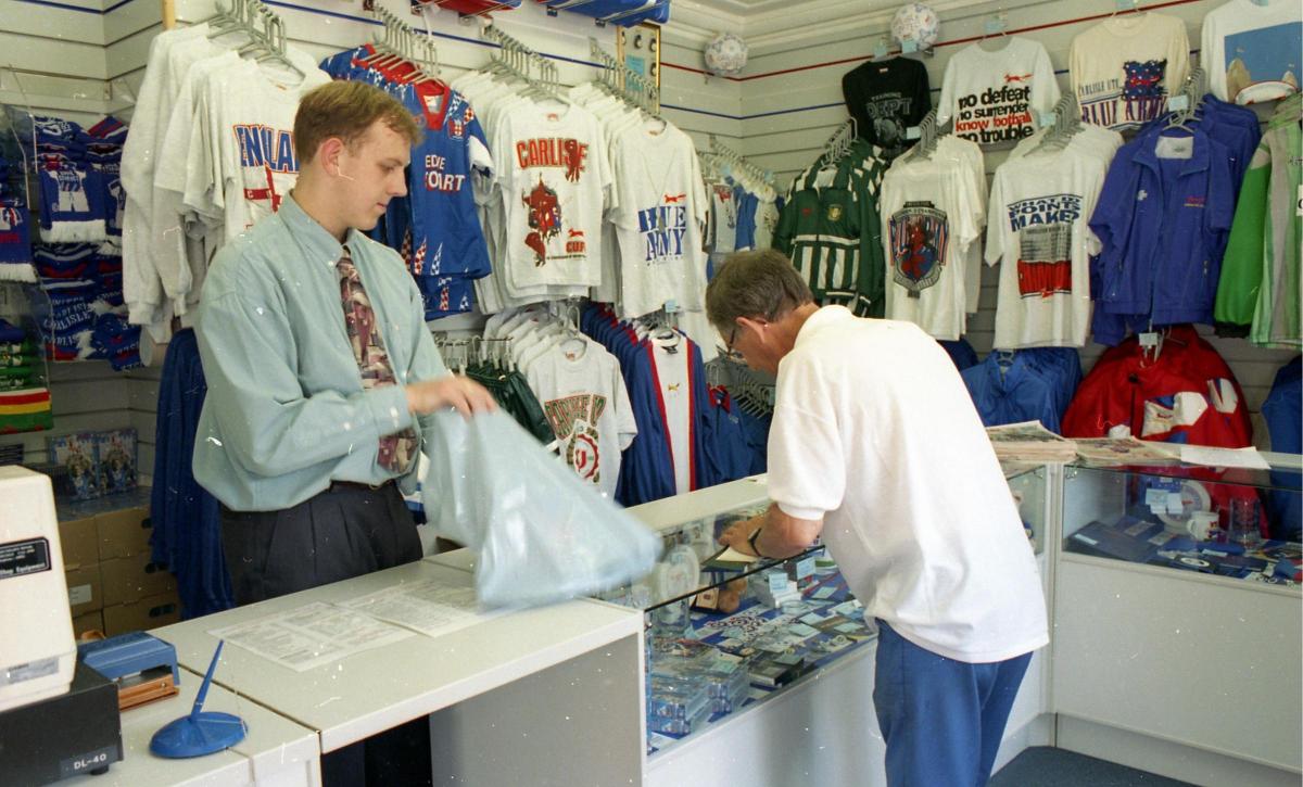
Carlisle United evidently think so. Currently in the club’s Blues Store there are six potential designs for next season’s kit. Fans are invited to choose their favourite and offer suggestions on how they can be improved.
The designs have not been shared beyond the shop’s walls yet, so we cannot reproduce them here. What we can do, though, is remember that this is not the first time United have dipped their toes into these particular waters.
Back in 1994/5, a season remembered for the iconic green, red and white ‘deckchair’ shirt along with a Division Three title and maiden Wembley appearance, Carlisle first decided to take the matter of their Saturday afternoon appearance to the masses.
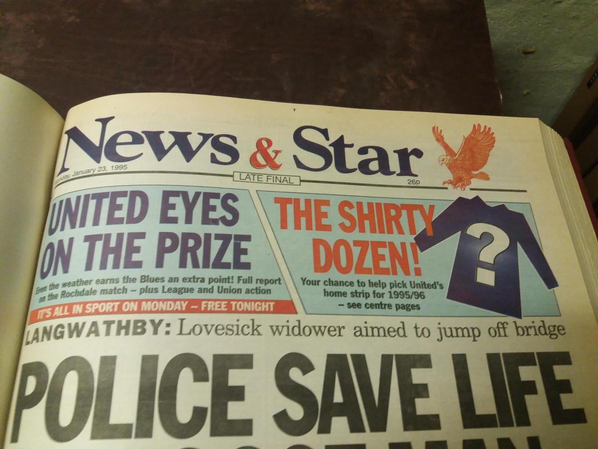
They teamed up with the News & Star to share a dozen possibilities; the shirt which attracted the most reader votes was then to be manufactured by the club’s new label, Red Fox, and worn by Mick Wadsworth’s team in 1995/6 and 1996/7.
Revisiting that initiative is a portal to an era when football clothing was, shall we say, in interesting times. “The late-80s, early 90s…it was a bit of a time that fashion forgot,” says Martin Hudson, United’s commercial boss of the time. “If you looked at kits in that period, they were really garish. You had kits with lots of flecks with different colours, all quite busy in the design.”
This is perhaps the best explanation for some of the unorthodox designs offered to the Cumbrian public in early 1995. The newspaper carried three different ones on consecutive days during a week in January, before presenting all 12 together, along with telephone and postal voting details.
Sobriety was scarce. Indeed, many of the efforts made one wonder if Jackson Pollock had been resurrected and put to work with a brief to make the deckchair seem restrained.
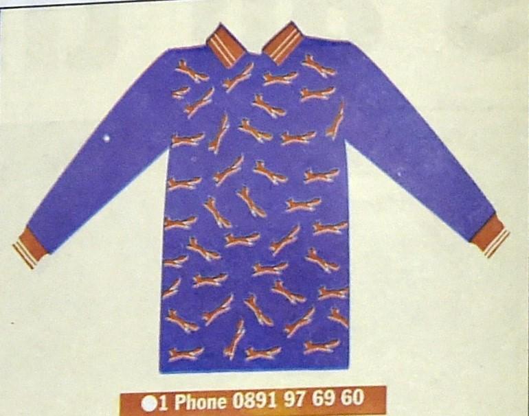
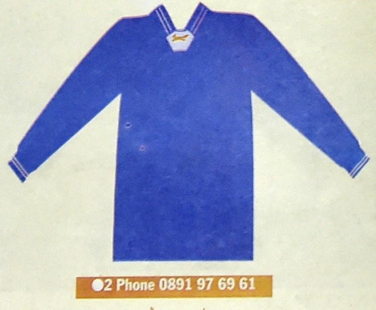
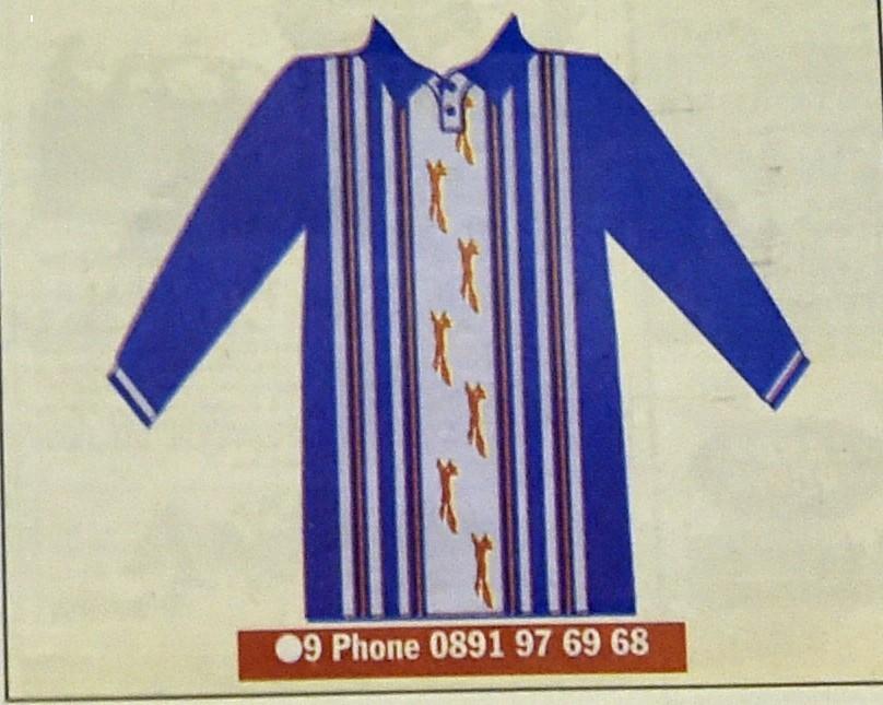
Design one, for instance, was a red-collared blue shirt with lots of little red foxes hurled onto the torso in random order. Number two was a rarity: a simple but classy all blue offering, which naturally stood no chance of winning.
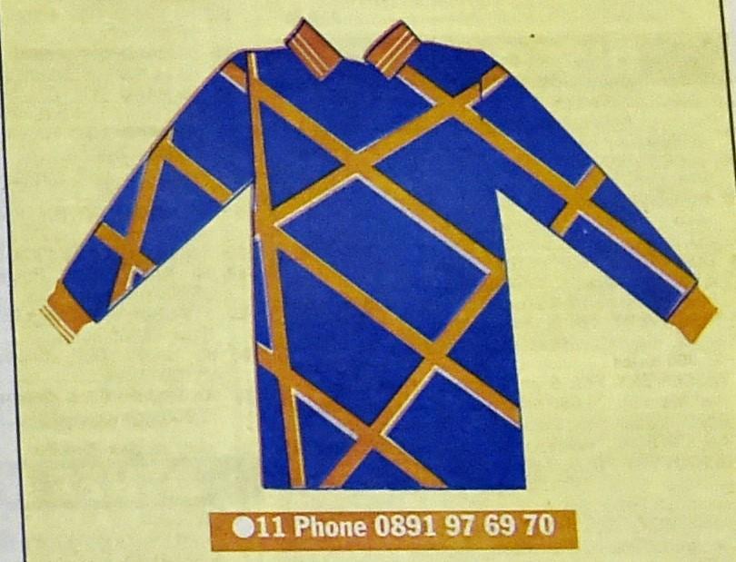
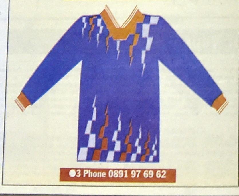
Number three – the eventual victor - featured red and white triangular flashes: an unlikely meeting between football shirt and carnival bunting.
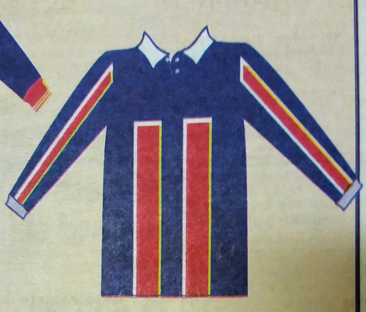
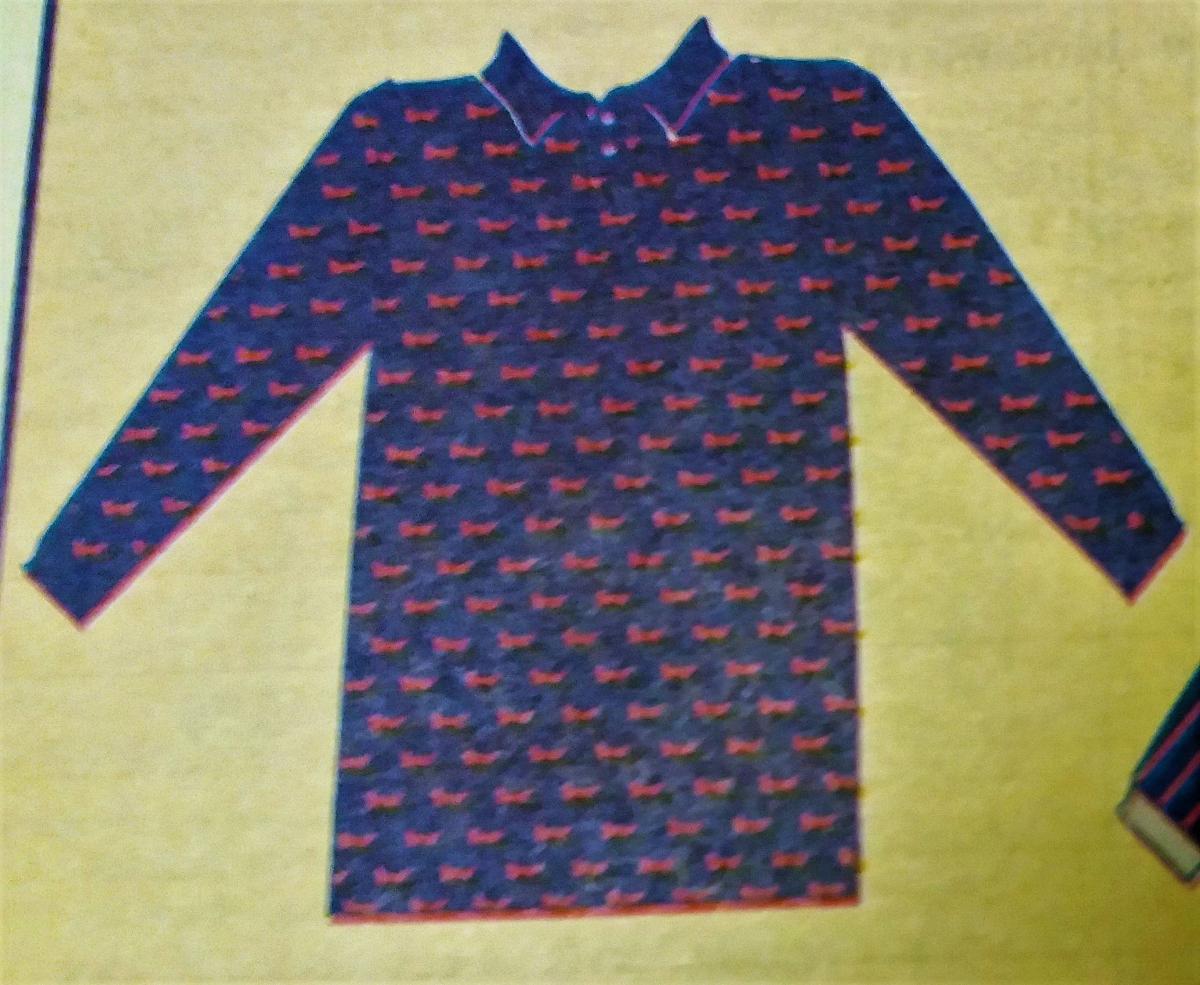
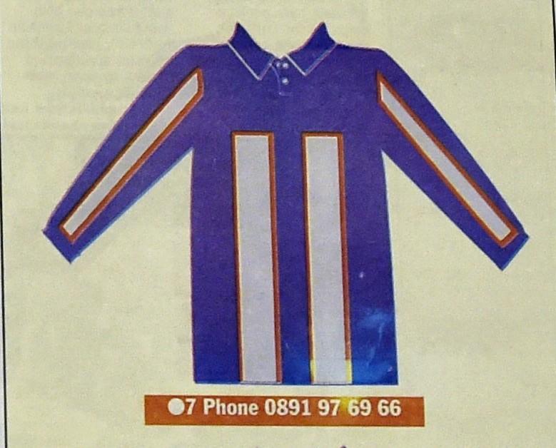
Number four’s hallmark was a pair of large, red vertical oblongs: neon skyscrapers heading up the ample front of Warren Aspinall, perhaps. Five was similar to one, but with smaller red foxes in a more orderly formation, including on the sleeves, making it resemble a pyjama top rather than a football shirt.
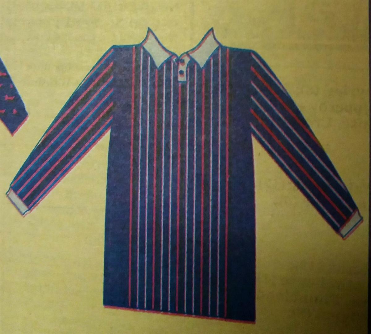
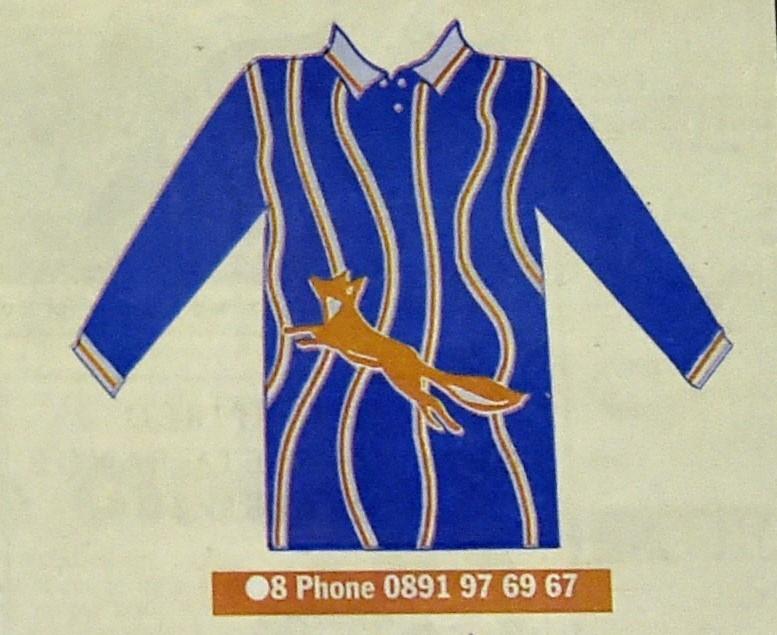
Six included a cluster of thinner vertical stripes in red and white, vaguely similar to what United’s future supplier Errea offered in 2000/1. Seven had white twin towers instead of red, while to glance at number eight is to be gripped by terror at the thought of how close Carlisle came to spending two seasons in something designed by someone blindfolded, spun around 10 times, asked to draw vertical lines on a moving piece of paper and then forced to play ‘pin-the-large-fox-on-the-shirt’, the iconic animal eventually leaning upwards at the sort of gradient that requires you to stay in second gear.
With such creative and random forces at work, it would perhaps have been the ideal kit for Michael Knighton’s United - more so even than nine, which looked like an intended homage to Carlisle’s 1974/5 kit but with the inevitable red foxes dashing up the main white stripe, with other, thinner stripes also muscling in.
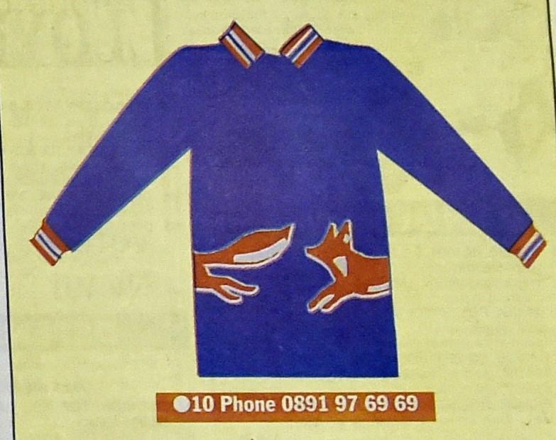
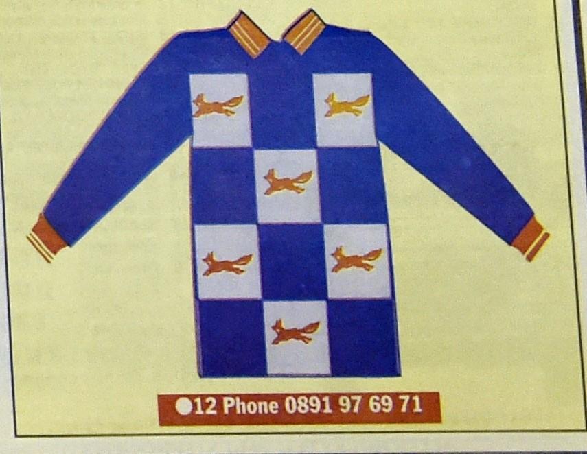
Number 10, meanwhile, offered the interesting spectacle of one fox pursuing the rear end of another, like dogs in a park. Eleven was a disorderly geometric arrangement of red lines, with no obvious pattern discernible, while 12 – a gathering of large white squares on blue, each containing (you’ll never guess) a red fox, was one third homage to Croatia, one third tea towel, one third chess board and no thirds normal football top.
Some 819 fans voted, as United prepared to move on from a 1993-5 home kit which was not, in itself, all that plain – much like the transforming club.
“I started at the club in March 1994,” Hudson recalls, “and at that time, the shop was essentially a hole in the wall downstairs in the house where some of the YTS players lived.
“I’d come from the clothing trade in London and I saw that that whole side of the club needed a revamp.
“We established a proper club shop, and once we had come to the end of the current kit contract with Matchwinner, we then created Red Fox, our own brand, and started taking a bit of control of it.
“In doing this, we thought it would be a good idea to ask the fans what they thought when we came to produce a new kit. It was in the relatively early days of Michael Knighton’s time and the club was on a bit of a high - there was a real feel-good factor. Different times...”
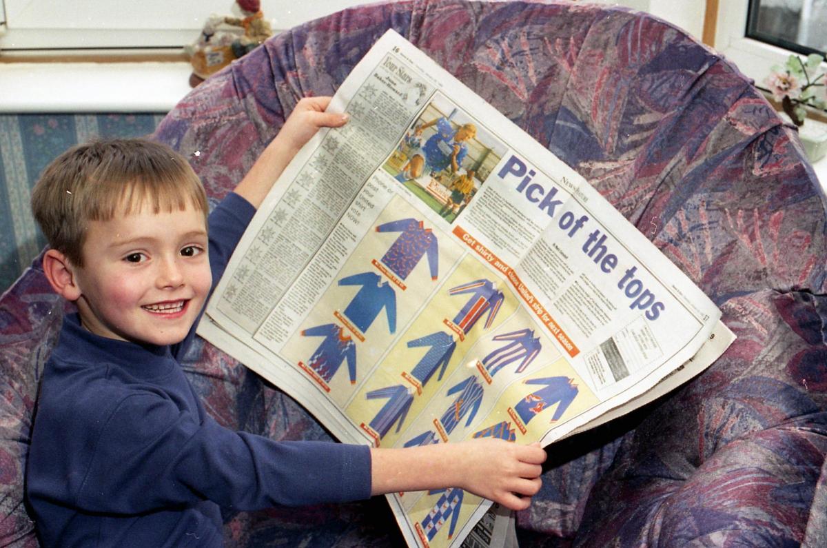
Hudson, who is now based in Wiltshire where he works for a Danish activewear firm, recalls that the ‘95 shirts were mainly produced by a manufacturer outside Cumbria, but some of the club’s leisurewear was created by a factory in Aspatria. A tour of this facility was on offer, as well as one of the first of the new jerseys, to one reader who voted for the winning design.
In the event, 196 people went for number three. That earned it the nod ahead of eight (squiggles monstrosity, 181 votes), and two (classy blue, 180 votes). Bringing up the rear with a miserable three votes was number 11 (red lines all over the parish).
Six-year-old Barry Bell, from Blackwell Road, was the lucky fan who won the competition, saying he had entered because his grandma urged him to, and that he had opted for three because he “liked the lightning flashes”.
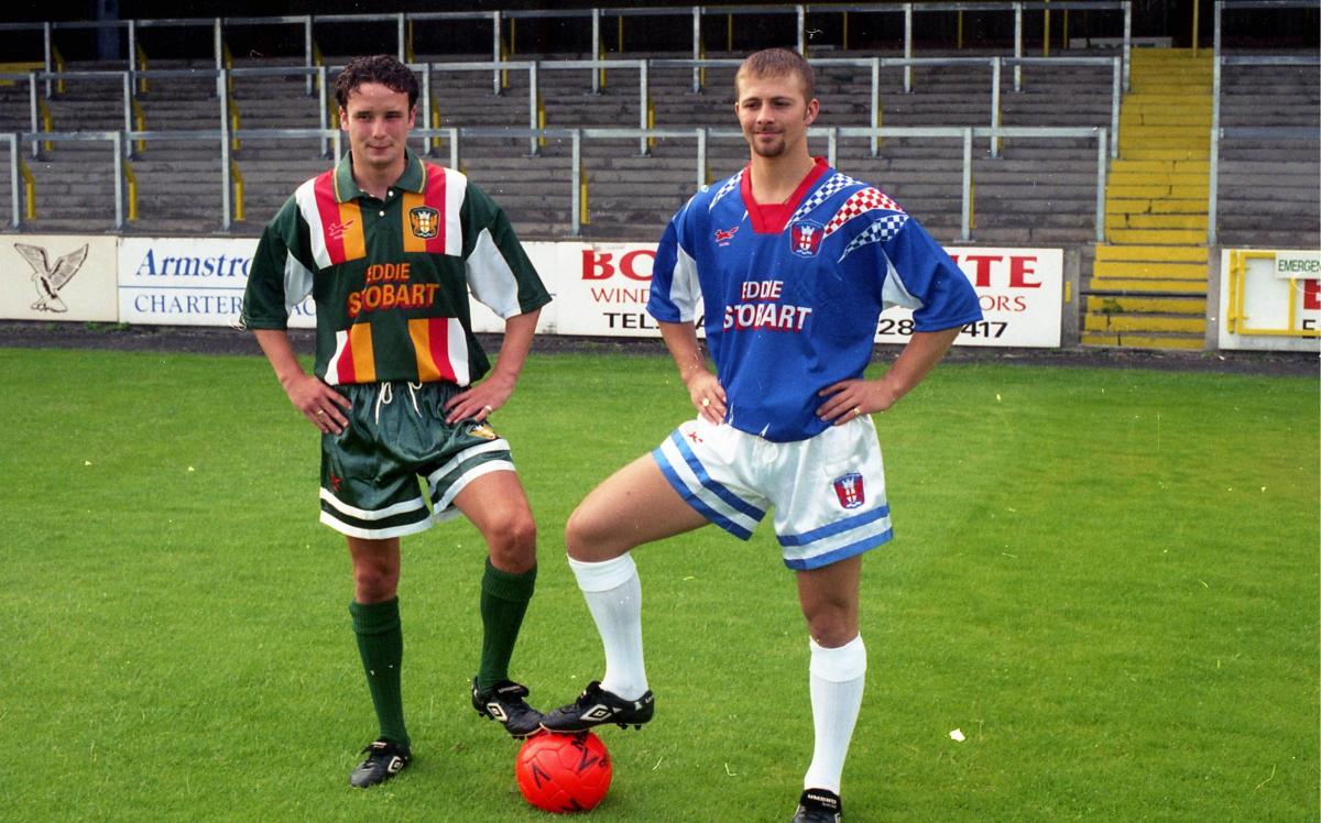
The end result was officially unveiled in July, modelled by trainee physio Neil Dalton. History may not judge the shirt as an all-time great but Hudson adds: “It’s not a case of whether we were happy with it or not. It was what the fans wanted and that was the most important thing.
“It was of its era, yes, but it was still a return to a more traditional Carlisle shirt - blue, mainly, with a bit of white and red trim on it.”
Upon its launch, it was accompanied by an away kit in the colours of new sponsor Eddie Stobart, whose name would remain on the front of the shirts for another 19 years.
In such designs did United’s Division Three champions move on to Division Two relegation and then a bounce-back promotion, plus an Auto-Windscreens Shield win at Wembley, in 1997, the kits forever associated with players such as Steve Hayward, Owen Archdeacon, Dean Walling and Stephane Pounewatchy.
We cannot know what path the Blues will take in their next kit, although fans may be reassured that the 2019 options are a little less lurid than those of the 90s. Hudson, at least, believes it is a good idea to go to the people again.
“I personally think it’s a lovely thing to do,” he says. “The more you can engage with supporters, the better.
“It’s nice to feel you have a say in what’s happening at your club – and the strip is very much part of your identity.”
See all 12 of the 1995 shirt designs in our picture gallery at the top of this article.


Comments: Our rules
We want our comments to be a lively and valuable part of our community - a place where readers can debate and engage with the most important local issues. The ability to comment on our stories is a privilege, not a right, however, and that privilege may be withdrawn if it is abused or misused.
Please report any comments that break our rules.
Read the rules here